
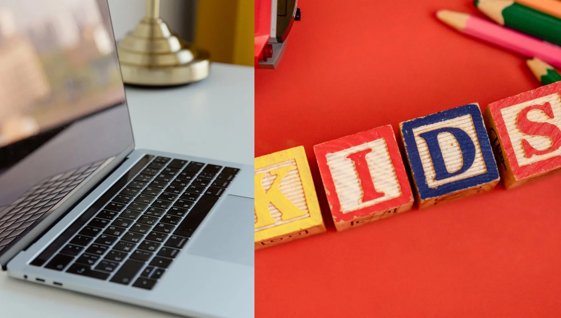
What Parents Really Look for in a Pediatric Therapist Website
It’s 10:47pm. An overwhelmed parent is sitting in bed, phone in hand, searching for “pediatric therapist in your city.” They click your website. In less than seven seconds, they’ve already decided whether to keep reading or hit the back button and try the next name on the list.
This isn’t hypothetical. It’s what happens every single night, across thousands of searches, in a city with hundreds licensed pediatric therapists. Most parents have options. Your website is often the first and sometimes only impression you get to make.
This post breaks down exactly what those parents are looking for when they land on your site, and the five most common reasons they leave without ever reaching out.
What Parents Look For in the First Few Seconds
When a parent lands on your website, they are not casually browsing. They are often overwhelmed, worried, and trying to make the best decision quickly. In those first few seconds, they are subconsciously asking three questions:
1. Am I in the right place?
Parents want immediate clarity. Who do you help? What age group do you work with? What concerns do you specialize in? If your homepage is vague or overly clever, they will move on.
2. Can this therapist help my child?
Specific language matters. Instead of general phrases like “supporting children,” parents are scanning for words like speech delay, sensory processing, anxiety, or autism support.
3. Do I feel safe here?
Design plays a huge role. Clean layouts, soft colors, and real photos create emotional reassurance. A cluttered or outdated website can signal disorganization or lack of care.
Visual suggestion:
Include a homepage mockup highlighting a clear headline, calming color palette, and a visible “Start Here” or “Book a Consultation” button.
Common Reasons Parents Leave a Website
Even highly qualified therapists lose potential clients because of avoidable website issues. Here are the top reasons parents click away:
1. Confusing Messaging
If a parent cannot quickly understand what you do, they will not dig deeper. Long paragraphs, jargon, or unclear headlines create friction.
Fix: Use simple, direct language. Think: “Helping children ages 3 to 10 with anxiety and emotional regulation.”
2. Lack of Personal Connection
Parents are not just choosing a service. They are choosing a person to trust with their child.
If your website feels generic or impersonal, it creates distance.
Fix: Include a warm, approachable photo and a short personal introduction. Let them see you as a real human, not just a credential list.
3. No Clear Next Step
Many therapist websites fail to guide the visitor. Parents are left wondering what to do next.
Fix: Every page should include a clear call to action. Examples include “Schedule a Free Consultation” or “Get Started Today.”
4. Overwhelming Design
Too many colors, fonts, or blocks of text can feel chaotic. Remember, your audience is already overwhelmed.
Fix: Keep your design simple, spacious, and easy to scan.
5. Missing Trust Signals
Parents are looking for reassurance. If your site lacks testimonials, credentials, or clear information about your process, it creates doubt.
Fix: Highlight certifications, include parent testimonials, and explain what working with you looks like.
What a Trust-Building, Website Needs
A high-performing pediatric therapist website is not flashy. It is clear, calm, and intentional. Here is what that looks like in practice:
Clear and Compassionate Messaging
Your homepage should immediately communicate who you help and how. Think of it as a reassuring conversation, not a sales pitch.
Example:
“You’re worried about your child’s anxiety. You’re not alone. I help children build confidence and emotional skills in a safe, supportive environment.”
Easy-to-Follow Structure
Parents should be able to navigate your site without thinking. A simple menu like Home, About, Services, and Contact is often enough.
Each page should answer one key question:
About: Who are you?
Services: How do you help?
Contact: How do I get started?
Warm, Professional Visuals
Your design should reflect both professionalism and approachability. Soft colors, child-friendly elements, and clean typography go a long way.
Avoid overly clinical or overly playful extremes. Aim for balance.
Real Photos and Relatable Content
Stock photos can feel impersonal. Whenever possible, include real images of your space, tools, or even yourself.
Parents want to picture their child in your care.
Simple, Reassuring Process
Explain what happens after they reach out. Many parents hesitate because they do not know what to expect.
Break it down into steps:
Schedule a consultation
Initial assessment
Personalized therapy plan
Clarity reduces anxiety and increases conversions.
Bringing It All Together
Your website is more than a digital brochure. It is often the first moment a parent feels hope, or decides to keep searching.
When your site is clear, welcoming, and easy to navigate, it does more than look good. It builds trust before you ever seak to a family.
The good news is you do not need a complicated or expensive design to make that happen. You just need the right structure, thoughtful messaging, and a focus on what parents actually need in that moment.
Want Help Putting This Into Action?
If you love the idea of a high-converting, trust-building website but do not want to figure it all out yourself, that is exactly why we created our Style & Launch customization package.
We take your template and customize it for you, from messaging and layout to visuals and final polish, so your site not only looks beautiful but works for your practice.
Because at the end of the day, your website should do one thing really well: help the right families find you and feel confident reaching out.